microsoft
Designing intuitive AI experiences within Microsoft Fabric.
00

problem space + context
Microsoft Fabric is an all-in-one analytics platform that brings data, analytics, and insights together in one place. It helps teams easily work with data, from ingestion to visualization, so they can make faster, more informed decisions without juggling multiple tools. This project explores how Fabric can better implement AI in a ubiquitous and non-intrusive way to enhance the user experience. We were tasked with delivering recommendations and high-fidelity prototypes that identify which features simplify the interface, and how we can better integrate AI into specific moments where it adds clear value.
solution
Based on competitive analysis, user interviews, and research into AI UX patterns, we designed 6 features that address key user needs and opportunities within the product. We designed features that include AI-powered tracing, topography-style data maps, and deeper Copilot integration, exploring the seamless integration of AI. As we deepened our understanding of the boundaries and capabilities of AI, we ensured these concepts were practical, measurable, and realistically attainable within the Fabric's ecosystem.
Guiding Question —
How might we… help users feel more in control and confident when navigating data flows by making Microsoft Fabric more accessible and personally relevant to their needs?
In short, we were tasked with implementing AI in Microsoft Fabric's ecosystem in a more seamless way!
Research & Strategy —
To gather both qualitative and quantitative research, we conducted a very thorough competitor analysis, 21 user interviews, and intensive research on AI UX patterns.
Platform Research
We started this process by doing in depth research on Microsoft Fabric itself. As college students, data analytics and business intelligence platforms aren't something that many of us have used. Through watching numerous YouTube videos, reading articles, reaching out to Fabric users, and inputing our own data to play around with the platform, we were able to build a very strong understanding of the platform and its functions.
Competitor Analysis
We then analyzed 6 competitors: Snowflake Data Cloud, DataBricks LakeHouse Monitoring, Amazon Sagemaker, SAP HANA Cloud, IBM Cloud Pak, and Google Vertex AI. Our analysis delved into their AI UX patterns, data processing methods, onboarding experience, and more.
User Interviews
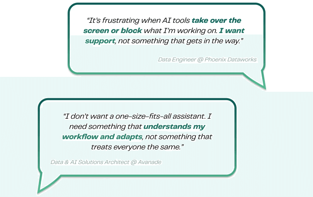
We then conducted 21 user interviews and found that users wanted more accessibility to data flows, greater flexibility in customizing their experience with Fabric, AI support without obstruction, and wanted to stay in flow without jumping between screens and tools.
Understanding AI UX Patterns
Additionally, we did in-depth research on AI UX patterns, as this was something we had never worked with. Learning about the difference between wayfinders, nudges, governers, tuners, and all the ways of implementing AI into tech platforms seamlessly, taught us about all of the nuances in this field. In a growing world of AI, this research was incredibly helpful and useful for future projects!
From all of our research, a key insight emerged: users didn’t want more AI — they wanted AI that stayed out of the way until it was useful.
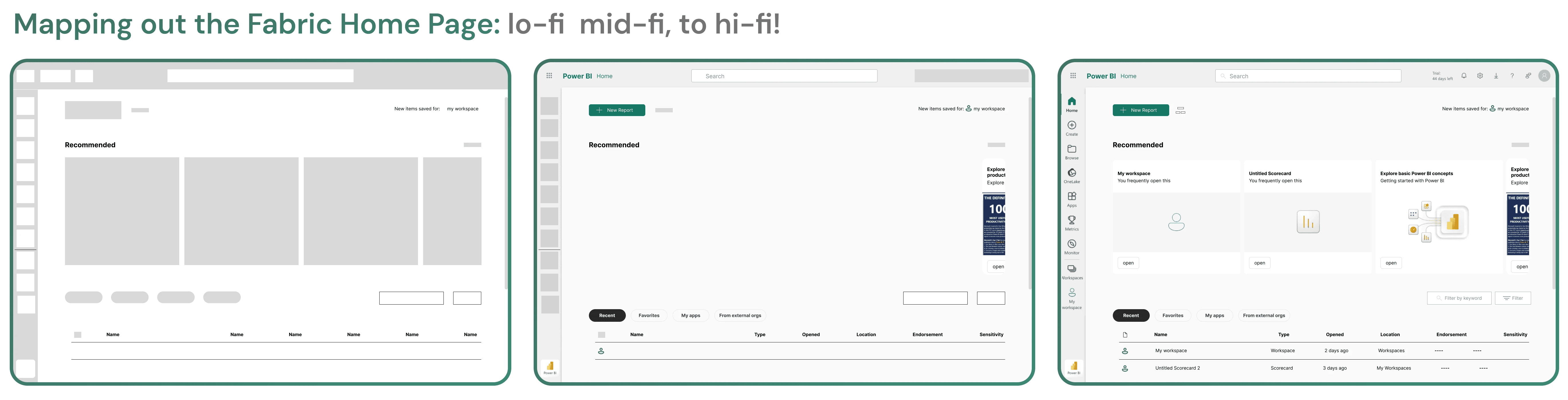
So then began the design process. Here is how we approached each design:
Solutions —
To combat the listed issues, we created and prototyped multiple different features into hi-fidelity designs!
Focus 1: Invisible, Context-Aware AI
We designed a suite of AI features that integrate naturally into existing workflows rather than interrupt them:
Copilot Flow: A modular, building-block system that lets users create data pipelines using a mix of structured inputs and natural language.
Adding tasks
Tackles: Customization and Organization
Importing sources
Tackles: Customization and Organization
Lets users build data workflows using freeform natural language, seamlessly combined with modular data sources.
Tackles: Flexibility
AI suggestions are created from prior behavior, frequently used data flows, and Copilot's understanding of the imported data.
Tackles: Personalization
Copilot Search: A conversational, intent-aware search experience that surfaces relevant assets even when users don’t know what to ask for.
Simply put, this feature surfaces what matters before you ask for it. It finds the right asset, even if you don't know what its name is. It gives you results with context and AI visibility.
Tackles: Navigation and Relevance
Together, these features reframed AI as a quiet collaborator — present when needed and invisible when not.
Focus 2: System Transparency Through Visualization
To help users understand complex data relationships, we introduced Topology Map & Trace. These were created with the goal of providing a clear, time-aware view of data relationships that help users quickly identify issues, understand system behavior, and take action.
Topology Map: This feature is a dynamic, AI-enhanced visualization that shows the relationships between datasets, pipelines, dashboards, and users across Microsoft Fabric. It helps users trace lineage, diagnose issues, and understand system-wide dependencies through interactive nodes, time-based views, and contextual Copilot insights.
Features seen in this prototype are the ability to see your entire data ecosystem at a glance, centralizing diagnostics within the monitor hub, and being able to filter results based on your user need.
Tackles: Transparency + Lineage
Here, I open the AI sidebar that explains every alert. This allows us to visualize data health without combing through messy logs. Copilot is used to break down the error so you don't have to.
Topology Trace: This feature is focused on understanding the system behavior before, during, and after an incident.
After choosing a date, drag the timeline and watch your data evolve. A calendar is also included for the ease of finding dates to check your data.
Hover to reveal the "why" behind every failure. Click into any error for instant Copilot analysis. Understand the root cause without having to leave the map.
Delivery —
Our team presented our features to our point of contacts at Microsoft as well as many other Senior Principal Designers — this was an incredibly cool and rewarding experience that allowed us to get thoughtful feedback and validate our ideas with industry leaders!

Our lovely team! ⭐️ 👯♀️
What I Learned —
Leadership Lessons
As the project manager of this team, I was tasked with leading a group of 5 consultants through the entire product development lifecycle. Faced with a rocky start, this was not an easy process. However, this was one of the most rewarding experiences of my college experience thus far. Working through early ambiguity, learning the platform, prototyping complex flows, and iterating as a team taught me the importance of time management, staying calm under pressure, and leading with empathy. I also learned that effective leadership doesn’t mean having all the answers — it means knowing when to ask for help and creating space for collective learning. Many of our best insights came from leaning on one another and growing together throughout the process.
Technical and UX Insights
Beyond leadership, this project deepened my understanding of AI, specifically AI UX patterns. In an increasingly AI-driven landscape, I learned how critical it is to design AI in ways that support user flow rather than dominate it. Thoughtful, non-intrusive AI integration can empower users, enhance confidence, and improve productivity—without disrupting their work.
Thanks for reading! Want to learn more about this project? Reach out via email (krisha.prabakaran@berkeley.edu) or LinkedIn, and we can find some time to chat!
year
Jan - Jun 2025
timeframe
10 weeks
tools
Figma, Microsoft Fabric
category
Product Design


