headspace
Adding "lovable moments" to a mental health care-space.
00

problem space + context
Headspace is a digital mental health platform that provides guided meditation, mindfulness, and mental health care services. Headspace’s Care services, while comprehensive, present limitations in user engagement. Lacking encouraging and pleasing visual stimuli within the interface of extended user flows, Headspace risks losing out on subscribers.
Guiding Question —
How might we... generate “lovable” moments to enhance the Headspace Care experience, enrich the platform’s interface, and better engage their members?
We defined a lovable moment as any interaction that feels fun, memorable, and genuinely uplifting: the kind of touchpoint that helps users move through the app smoothly, finish what they came to do, and actually want to come back.
Our Process —
Understanding the brand identity, research, solution ideation, and finally, delivery.
Understanding the Headspace Brand
We started by doing our own research and mood boarding to capture the main essence!
Research —
We used diary entries to spot where lovable moments naturally show up.
Over seven days, we wrote detailed diary entries for each of the following competitor apps to see how they deliver lovable moments. For example, how they make users feel, how they reinforce the brand, and how those moments hold up (or fade) over time.

We used these to discover what made popular apps lovable. For Discord, it was its hidden easter eggs. For Flora, it was its motivational messages.
& then we analyzed the existing Care space to discover areas of improvement and user pain points.
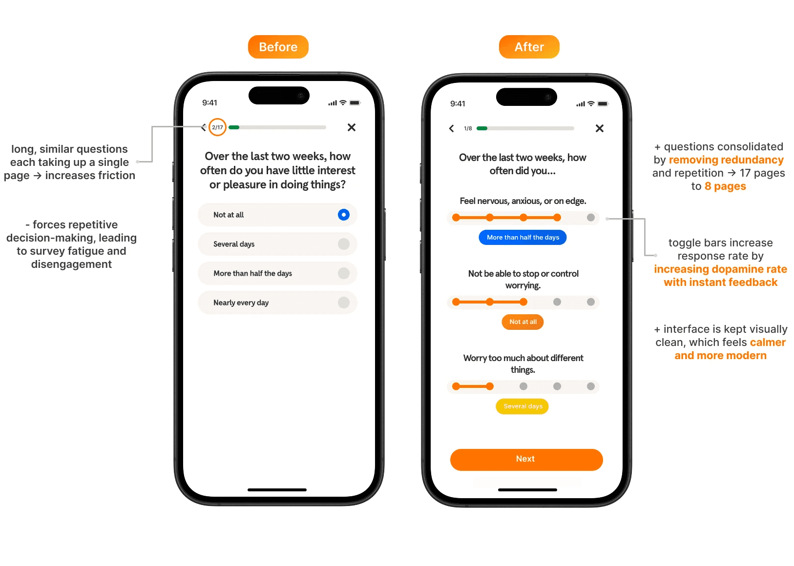
Our main observations: long questionnaires created friction for users, sound cues made experiences more enjoyable, and live chatbots with human components created more comfort.
Using these, we created a couple features grounded in removing redundancy, increasing lovable moments, and creating a more enjoyable experience for users.
Solutions —
💡 Clean Toggles Over Redundancy
By grouping similar questions on one page and using toggle bars instead of multiple-choice options, users breeze through surveys with way less friction.
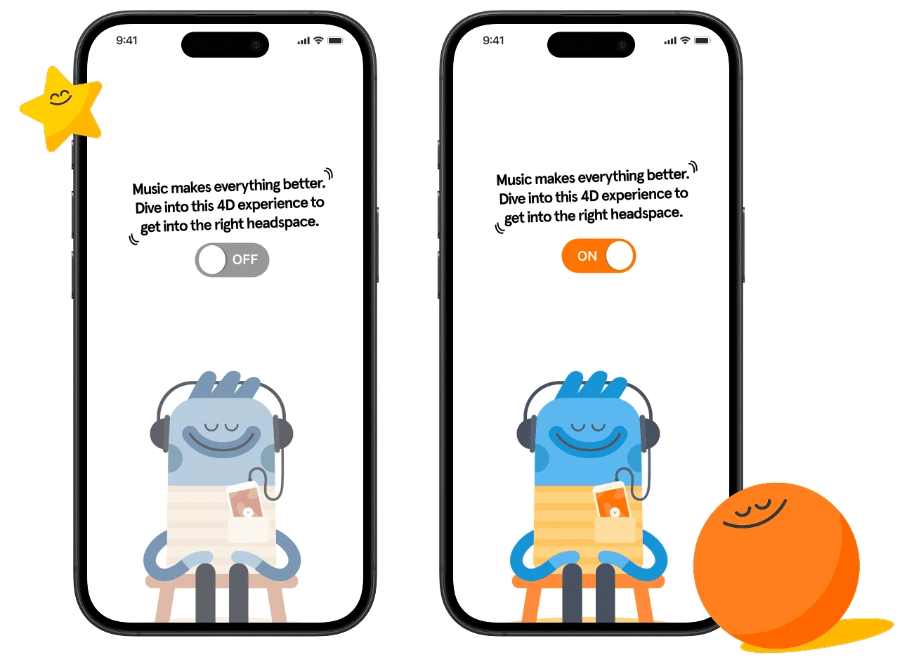
🎧 Immersive Experience with Sound Cues
We explored subtle audio prompts to give users an extra nudge of immersion and make the Care space feel more alive.
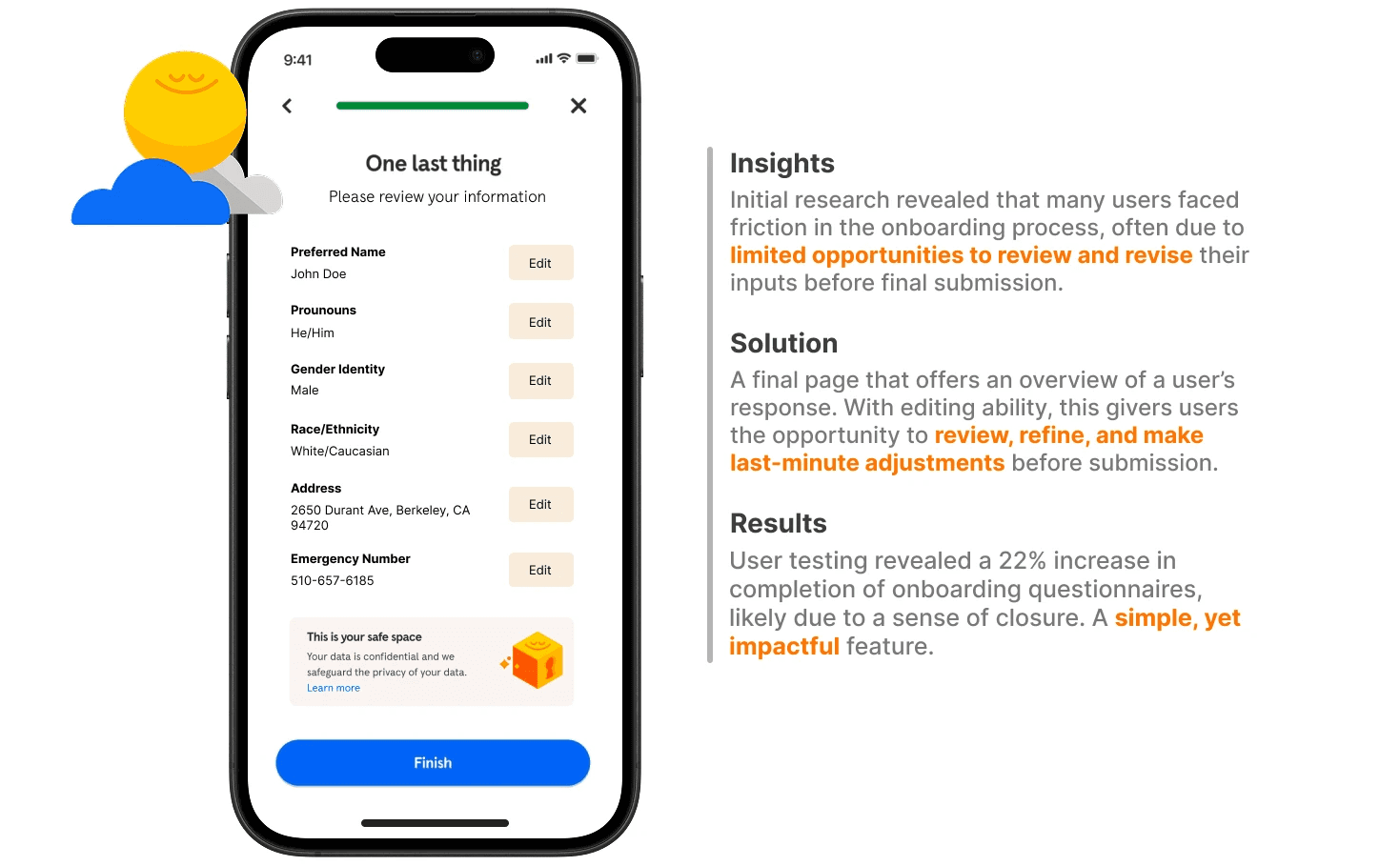
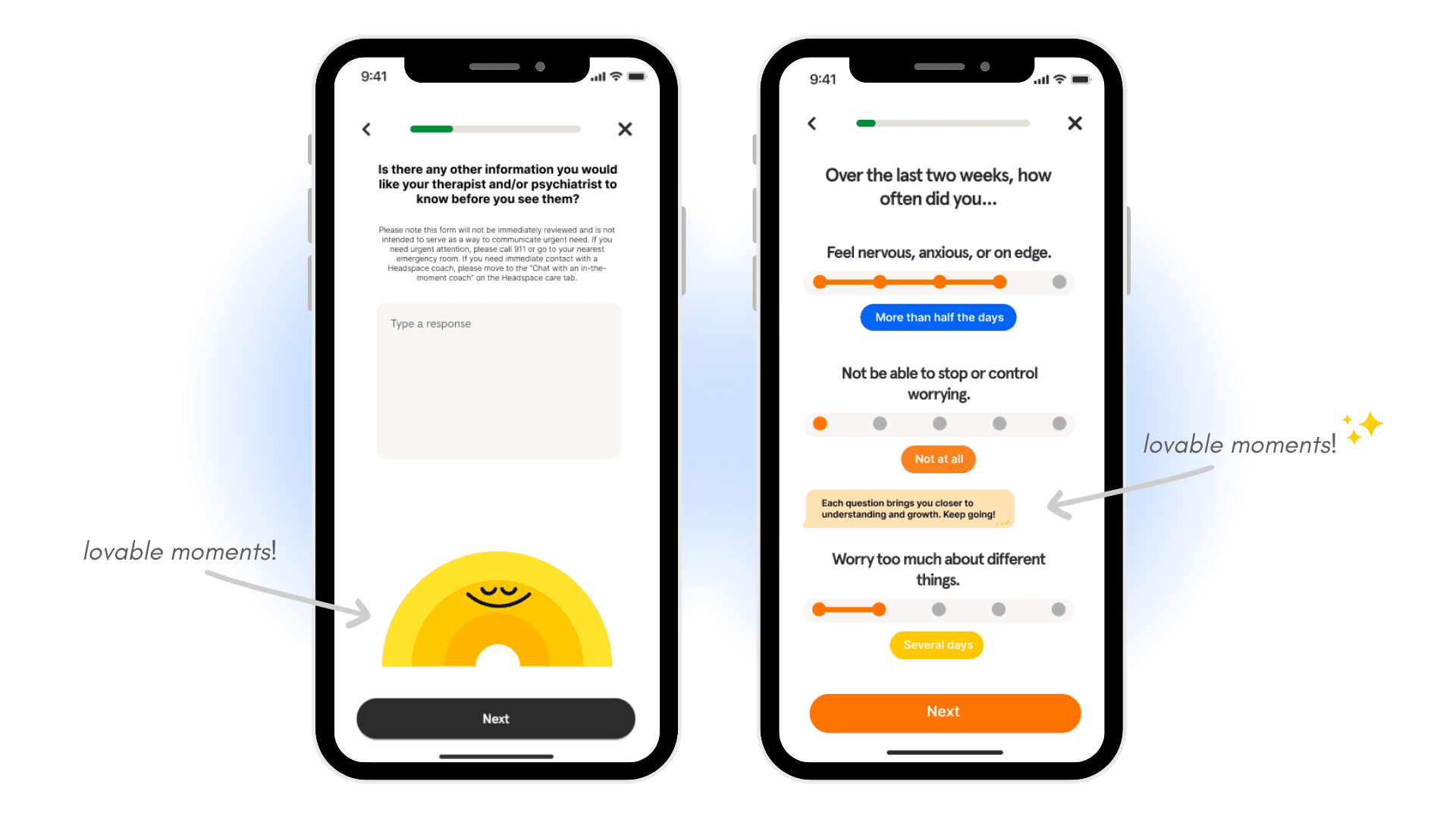
🫂 Design for User Closure
After long forms, a quick overview helps users feel oriented—not lost—creating a smoother handoff into the Care experience.
✨ Elevate Idle Animations
Turn waiting time into a warm moment. Instead of empty white space, friendly animations greet users and make the whole experience feel more inviting.
💌 Passive Lovable Moments
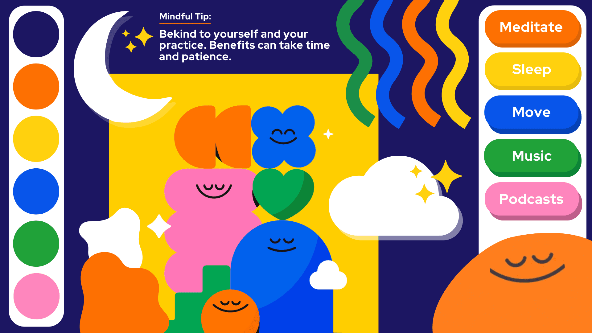
Sprinkled “lovable moments” in the form of graphics and motivation quotes break up long surveys, calm anxiety, and keep users motivated to push through.
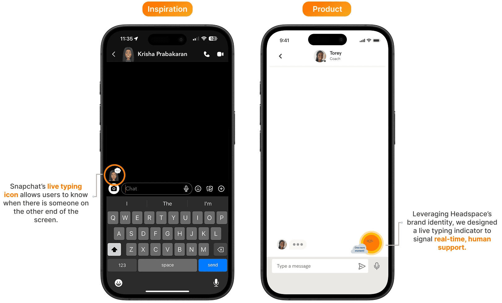
🙋♀️ Human Cues in the Chatbot
Human cues within the chatbot reinforce the feeling that a real person is present on the other end. This familiarity builds trust, lowers anxiety, and makes conversations feel more human.
What I Learned —
As my very first client project and my first try at Figma, this project was the catalyst for my passion for design. I learned how to design following an establish brand, to animate in Figma, and to balance sparking joy while maintaining emotional nuance in the Headspace Care experience. During this project, I focused on honing the lovable moments that make a digital experience memorable.
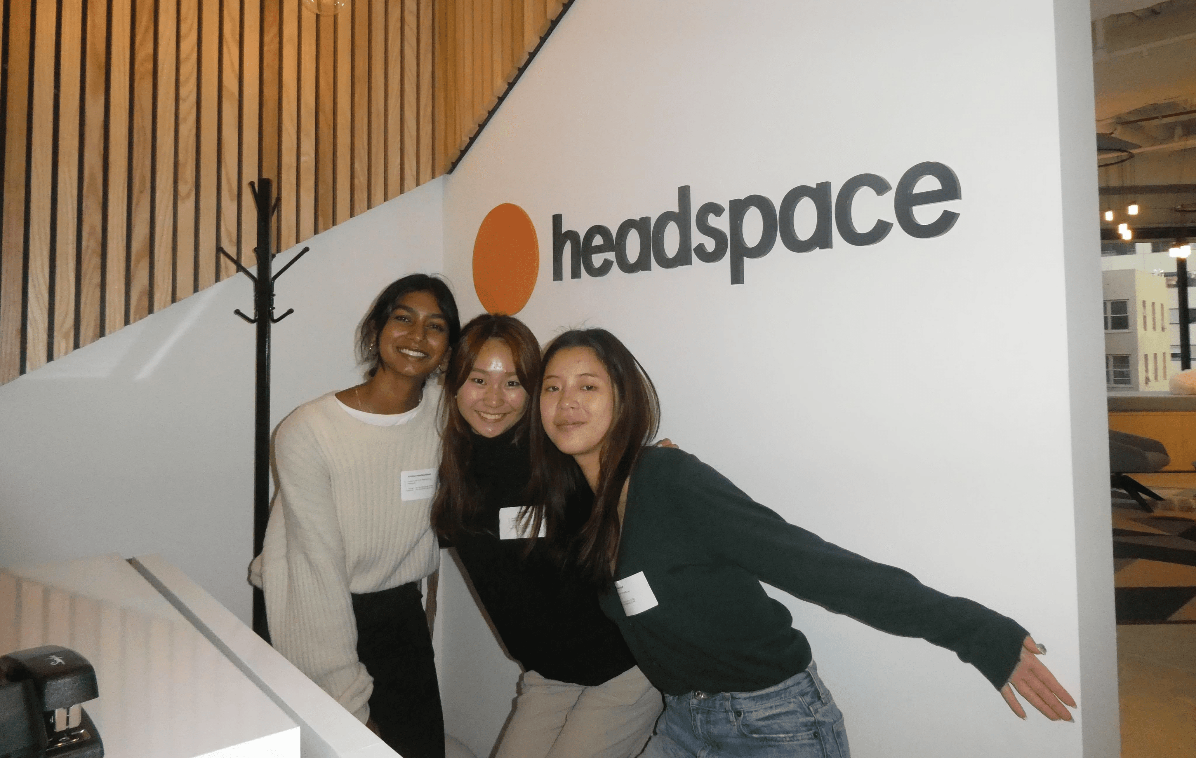
Us at the Headspace HQ in SF!!
Thanks for reading! Want to learn more about this project? Reach out via email (krisha.prabakaran@berkeley.edu) or LinkedIn, and we can find some time to chat!
year
Jan - May 2024
timeframe
10 weeks
tools
Figma, Adobe Illustrator
category
Product Design


